How to make a graphical abstract for your paper
The graphical abstract is the first thing an editor and reader see. A strong visual summary boosts readership, sharing, and your odds of acceptance — and you don't need design skills to get one. Describe your study in one sentence and get a publication-ready graphical abstract in seconds.
What a graphical abstract is
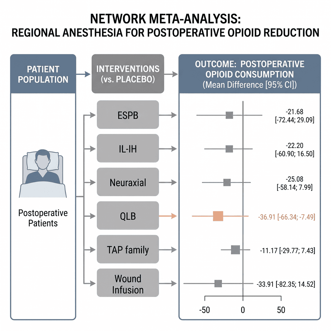
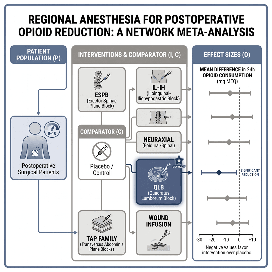
It's a one-figure visual summary of your study: who was studied (population), what was done (intervention vs. comparator), and what happened (outcomes), connected by arrows that tell the story in seconds. Most high-impact journals now request or encourage one, and many feature the best ones on social media.
What a good graphical abstract needs
A left-to-right read (population → intervention → outcome), short real labels (no placeholder text), simple line icons, a restrained palette with one accent on the key finding, and a white background. Less is more: if the reader has to stop and decode it, the figure failed.
Common mistakes that sink the figure
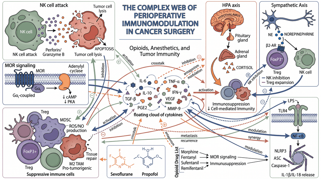
Too much text and long sentences inside the image; too many colors competing for attention; mismatched icon styles; and unsourced data. A visual summary is not the written abstract pasted into a box — it's the study's structure translated for the eye.
- 1Describe the study in one sentence
e.g. "regional anesthesia vs. opioids in surgery — outcome: opioid consumption and postoperative pain".
- 2The assistant structures the brief
It turns your sentence into a model-ready prompt with layout, labels, and palette. You review it before spending a credit.
- 3Generate and export
Get the figure in seconds (or 3 variations to compare) and download PNG, TIFF 300 DPI, or PDF in the journal's format.
Create your graphical abstract now
Describe the study in one sentence and get a publication-ready graphical abstract. No subscription — pay only for what you use.
Start a new figure